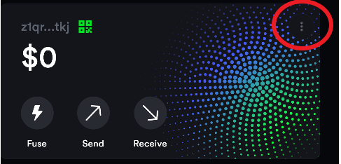
Increase contrast of the “…” button with the background. At least to the lighter shade of the Fuse,Send, Receive buttons.
After copying the wallet address to the clipboard, I think the initial bottom modal popup notification is enough. The top right Bell indicator should not light up with the same (1) notification. I think showing the notification is fine when you open the bell, but should be shown as already greyed out given the user has already seen it at the bottom once.
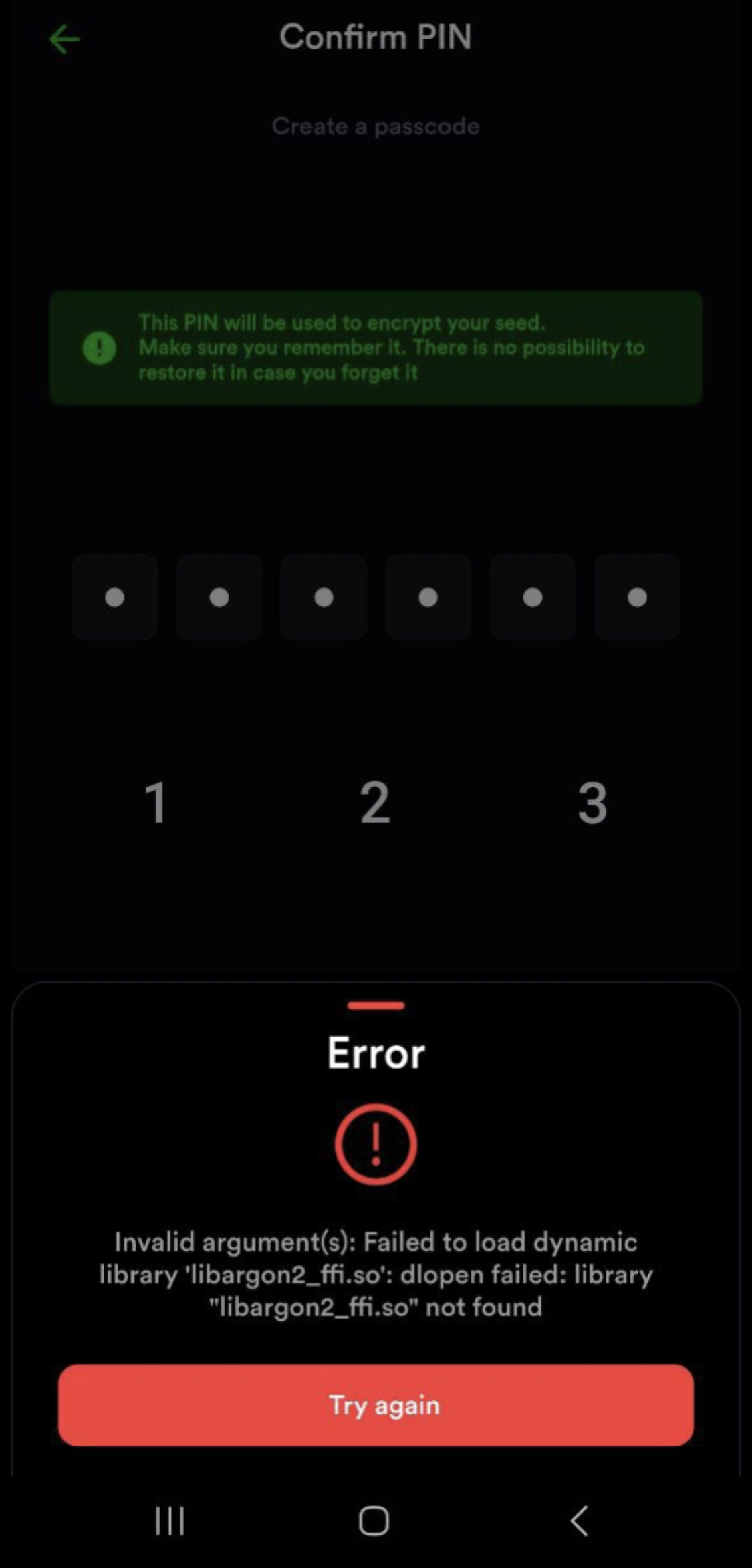
Possible bugs:
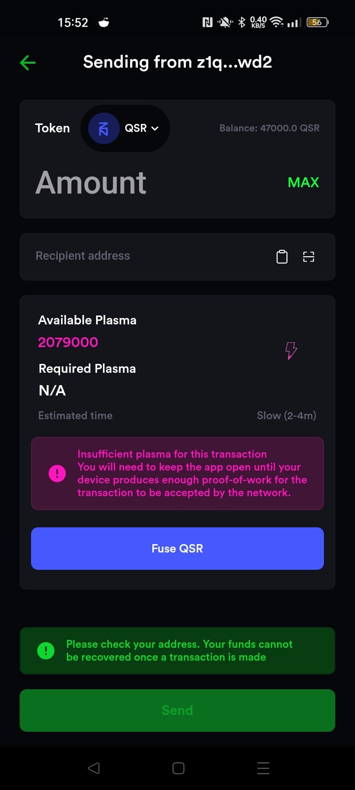
Endless loading indicator in the assets tab on the main screen (I think I’m correctly connected to the testnet node, no reason for it to permanently load). Could use some QSR to test fusing and other functionality, please send testnet funds to:
I was reporting it does work sorry for the confusion
Tested the newest version too, experienced the same lag on entering the last pin digit as @crack above
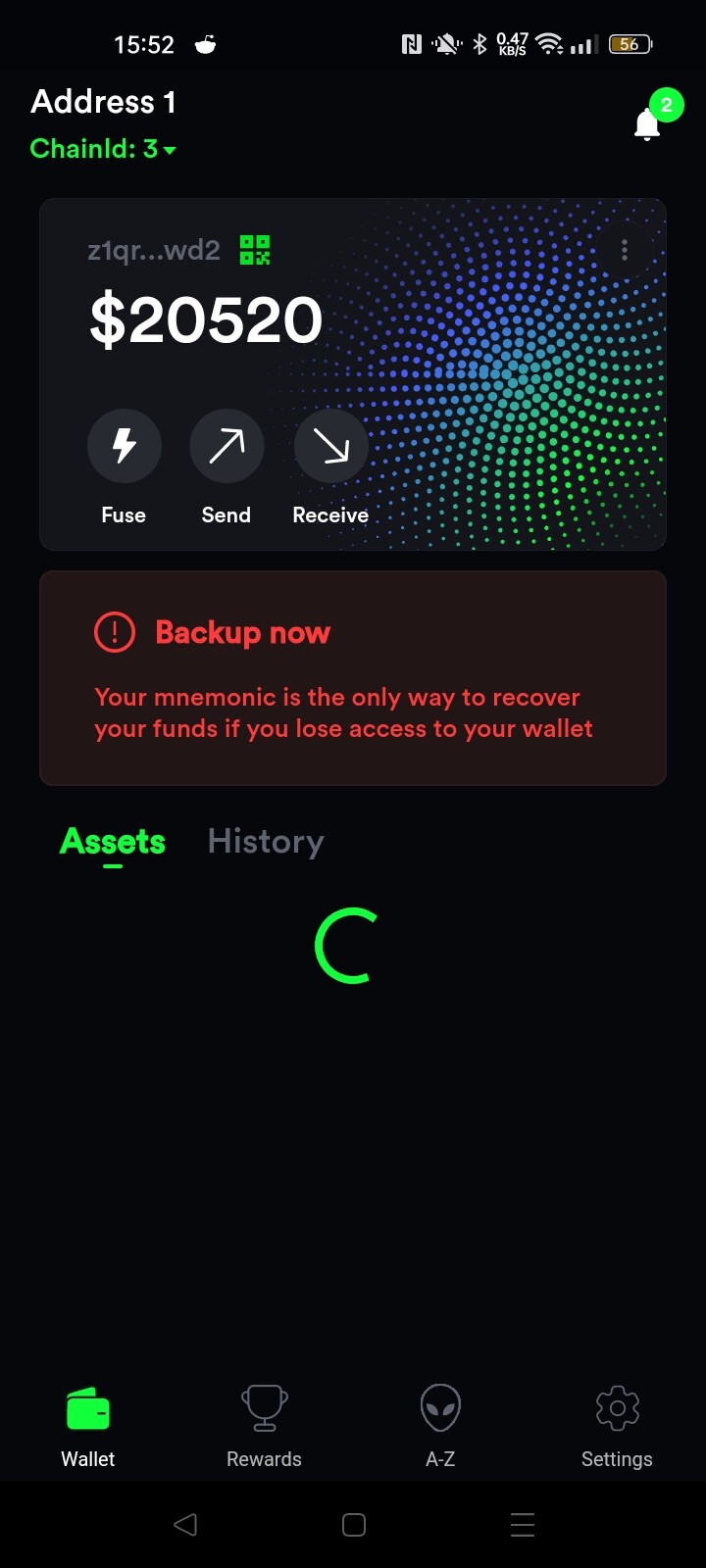
Also still have the spinning wheel under Assets tab always
Another UX suggestion: add a plasma indicator on the Wallet page for the selected address. Like a bar or something that is filled a percentage based on how much plasma you have fused?