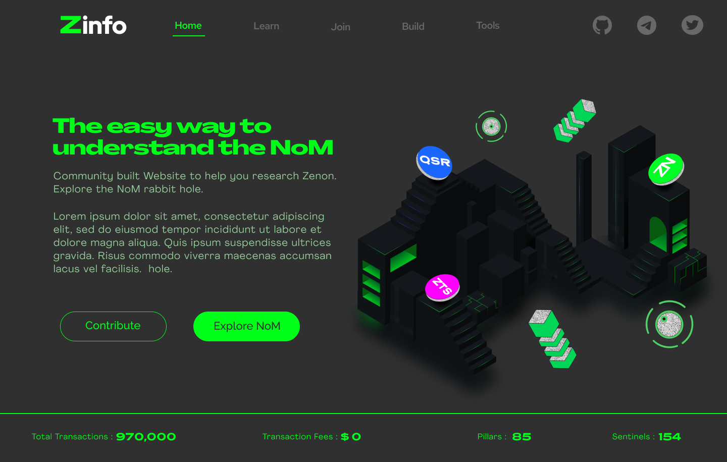
Our based community member @ZNNAYIID jumped in to propose a home page design for zenon.info. What do you guys think?
2 Likes
I think the green matches nicely with the background color. The Zenon temple comes out a bit dark on some of my devices. In those cases the whole structure just looks like one black image. I don’t like the green color of the pillars and sentinels. Feels a bit off in comparison with the main green color. Also I think the green color of the ZNN coin is too bright. Not creating enough contrast between the white and the green. It depends on the device, sometimes it just looks like a bright green circle.
I hope this helps.
1 Like
Thanks for your feedback sir, I tried to change everything you mentioned above. Please if you think something else needs to be changed let me know.
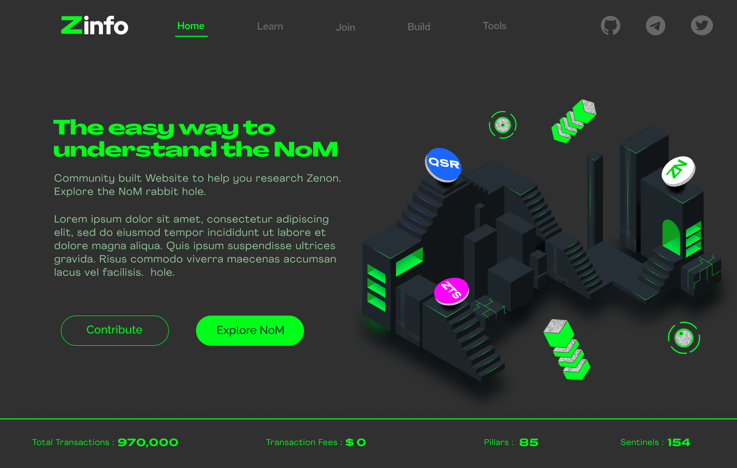
I can now see it much better on my mobile phone. Great work. I will try some other devices, to make sure.
EDIT: checked all devices, all looked fine.
1 Like