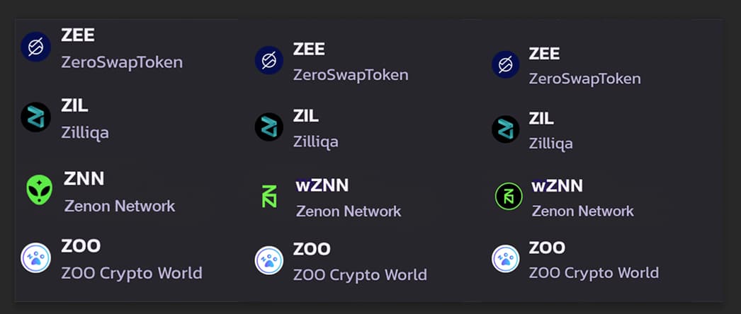
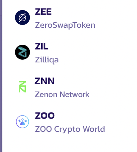
I think the ZN is really hard to see when it’s small like this. But this is what it will look like on a phone… don’t you think?
I agree. the gradient does not scale down well. Here it is, at right without gradient. Nothing is lost, while clarity is gained.
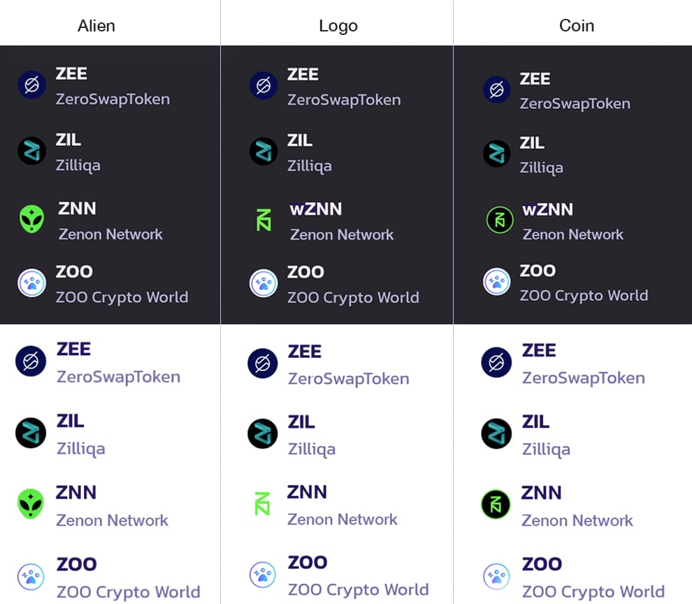
I’ll put the light mode mock-ups into the same configuration as the dark, above. I think these are the three finalists.
@mr.ztark do you want to make a new post asking for a vote on the logo? Like Option 1, 2 or 3? Let’s show the logo and them in action with a white and black background.
I want to get this PR drafted up and submitted to AZ. I will be asking for reimbursement of 5 BNB to submit the PR to add our logo to trustwallet & PCS.
Sounds good. I will do the light and dark mode mockups tonight, before midnight EST
Cool. I think we should keep working on this token and publish it. Even though we already got the Rango listing. There will be benefits to getting the token published.


